Pretty Paper Obsession

Dream Big

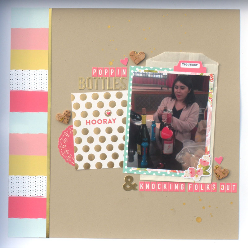
I’ve always considered myself a simple scrapper. I’ve never been much of an embellisher and always strived for the proper balance of “things” vs white space. Don’t get me wrong,  I love to watch process videos of ladies who can create paper layers behind their photos and embellishment clusters, but I haven’t been able to do so myself. And I’m okay with that. But then there’s this:

This layout was easy and complicated all in the same breath. When I received this picture of my BFF I knew I wanted to use red as the primary color. And I’ve had this awesome paper pad from MME for a while. Once I came across this paper with “Dream Big” on it, I wanted to use it but I wasn’t so sure about the pink background. I decided to push forward anyway. And I knew from the start that I wanted to use a cut file behind the photo. Alright roses it is. But after that things got complicated. I looked through my red embellishments and came up with the sequins and… that was it. I seem to have a shortage of red embellishments.
Is there any such thing as too simple? When I look at this, i think yes. But I have tried adding things and nothing feels right. I do plan to add journaling strips to the lower right hand side (I usually journal after I’ve taken photos for public sharing), but other than that I can’t make anything work. What do you think? Are you a simple scrapper or do you embellish like crazy?
Advertisement

Red Rose Invitaions

Hello!When my Mom decided she wanted to have a birthday party she looked me in the eye and said “You know you’re making my invitations, right?” and my reply was “I wouldn’t have it any other way!” So after weeks of designing, printing, cutting, and splattering calligraphy gouache all over red envelopes I am happy to say that yesterday was mail day. In the end, they turned out great but I may have pulled out a few hairs before it was over with.

My mom loves red and decided she wanted red and white for the color scheme. And since her birthday is in February, roses quickly became the decor staple. I decided to do a 5×7 flat panel card. I let her chose between a mounted and unmounted card. She chose mounted. More cutting, but that was the easy part.

img_3925

I love, love, love how the invitation turned out.

assembled invitaions

The hard part was addressing the envelopes. Although I had been practicing my calligraphy and was hesitant since this would be my first time doing a project of this nature, I was not prepared for how difficult this turned out to be. The envelope texture was not as smooth as I would have liked and the gouache I mixed would immediately drip from the nib as soon as it touched the paper. FRUSTRATING! A trip to the art supply store was in order.

I purchased gum arabic, new nibs, extra gouache (feeling really hopeful) and a jar of Daler Rowney Pro White (they didn’t have the DR PH Martins Bleedproof White)as a backup plan.  Adding the gum Arabic to the mixed gouache helped a bit but the biggest difference was the new nib. At least then I was able to get them done. They are certainly far from perfect, but they are done. And that feels pretty awesome.
envelopes with calligraphy

Once they were all addressed, I added a return address label to the back. I didn’t want to do it in calligraphy and I really like the rose on the back of the envelope. I was happy to get a postage stamp that matched so well and even happier when I dropped them into the outgoing slot at my post office.

imageHow about you? What projects are you currently working on?

Hello 2017

Hello! I hope your new year is off to a great start. For me, this year is all about big dreams, big visions, and big things. So, I decided to create a vision board for 2017 to help remind me what I’d like to accomplish this year. I started with some of my favorite Felicity Jane papers from the Oh Deer! and Hello Christmas! kits. I also gathered some of my favorite Pinterest images – I didn’t have any magazines handy and didn’t want to wait any longer.

img_3846

Then I used my Silhouette Cameo to print & cut some key words that represents each area of my level 10 goals. After that it was all about arranging everything. In the end this is what I had:

PPO Vision Board 2017

At this point I decided that I wanted to add the black star sequins that came in the Felicity Jane Oh Deer kit because why not. The final setup includes my Elise Joy 2017 goal tracker, some awesome list papers from Typo, some wood veener words that I picked up in Venice Beach on Christmas vacation, and a set of string lights to light up my vision even in the dark.

dscn4104

I love how it turned out and I can’t help but be inspired when I see it. What about you? How are you keeping your 2017 goals front and center throughout the year?

PPO FJchloe layout #1

Felicity Jane Chloe kit Layout #1


PPO FJchloe layout #1

After finally cutting into my Felicity Jane Chloe kit in order to make dividers for my personal size planner, I created this layout. The colors in this kit were perfect for these photos of our first GNO Thursday Night Bingo. This photo is actually from a video I caught of my friend opening the bottle of champagne. The stopper flew up, hit the ceiling and then bounced off three people before landing on the floor. Luckily no one was injured.

I used the kraft cardstock that came in the kit as my background. I decided to use the Heidi Swapp gold color shine to try the drops technique for the first time. Yes, it’s true: I had never dripped mist before creating this layout. I knew from the moment  I saw the paper with the bold stripes that I wanted to use a vertical strip of it. I added a thin strip of the gold foil paper from Pebbles’ Home+Made collection by Jen Hatfield.   I used the Chloe papers and a glassine bag to layer the photo even though I really wanted to see more of that beautiful floral print. Luckily there’s plenty left for another layout. The diecut card is from the My Mind’s Eye On Trend 2 cut apart sheet. I simply added one the FJ Chloe puffy hearts. The FJ stamps made the perfect caption for this memory. I stamped on a tab from the exclusive cut apart stickers that came in the kit. The diecuts are from the My Mind’s Eye Hello Gorgeous diecut pack. I paired letters from the On Trend 2 sticker sheets with some October Afternoon Mini Market tile letters that were in my stash to create the title. The Pink Paislee C’est La Vie cork hearts with the gold foil were the perfect finishing pieces for this layout. The bright and fun colors and patterns in this kit really capture the fun we had that night.


Materials used:

Felicity Jane Chloe kit (April 2016)

My Minds Eye On Trend 2 Stickers Sheets and Little Things paper

My Minds Eye Hello Gorgeous diecuts

Pebbles Jen Hadfield Home+Made gold foil paper

Pink Paislee C’Est La Vie stickers

October Afternoon Mini Market letter stickers

Heidi Swapp Color Shine

glassine bag

Check back soon for my next layout with the beautiful Chloe kit by Felicity Jane.

Thanks for stopping by,

signature